What Diversification Actually Looks Like

Most investors evaluate portfolios by focusing on long-run returns. But portfolio construction is just as much about shaping the distribution of outcomes investors experience along the way.
The chart below compares monthly return distributions since January 2007 for three different portfolios:
A US equity portfolio
A traditional 60/40 portfolio
A diversified global macro benchmark portfolio
All portfolios are constructed using liquid ETFs and rebalanced monthly.
The period includes multiple macro and market regimes:
the Global Financial Crisis,
the Euro sovereign crisis,
the COVID shock,
the 2022 inflation and bond selloff,
and the post-pandemic AI-driven equity rally.
The objective is not necessarily to maximize returns at all costs, but rather to understand how diversification changes the shape of portfolio outcomes over time.
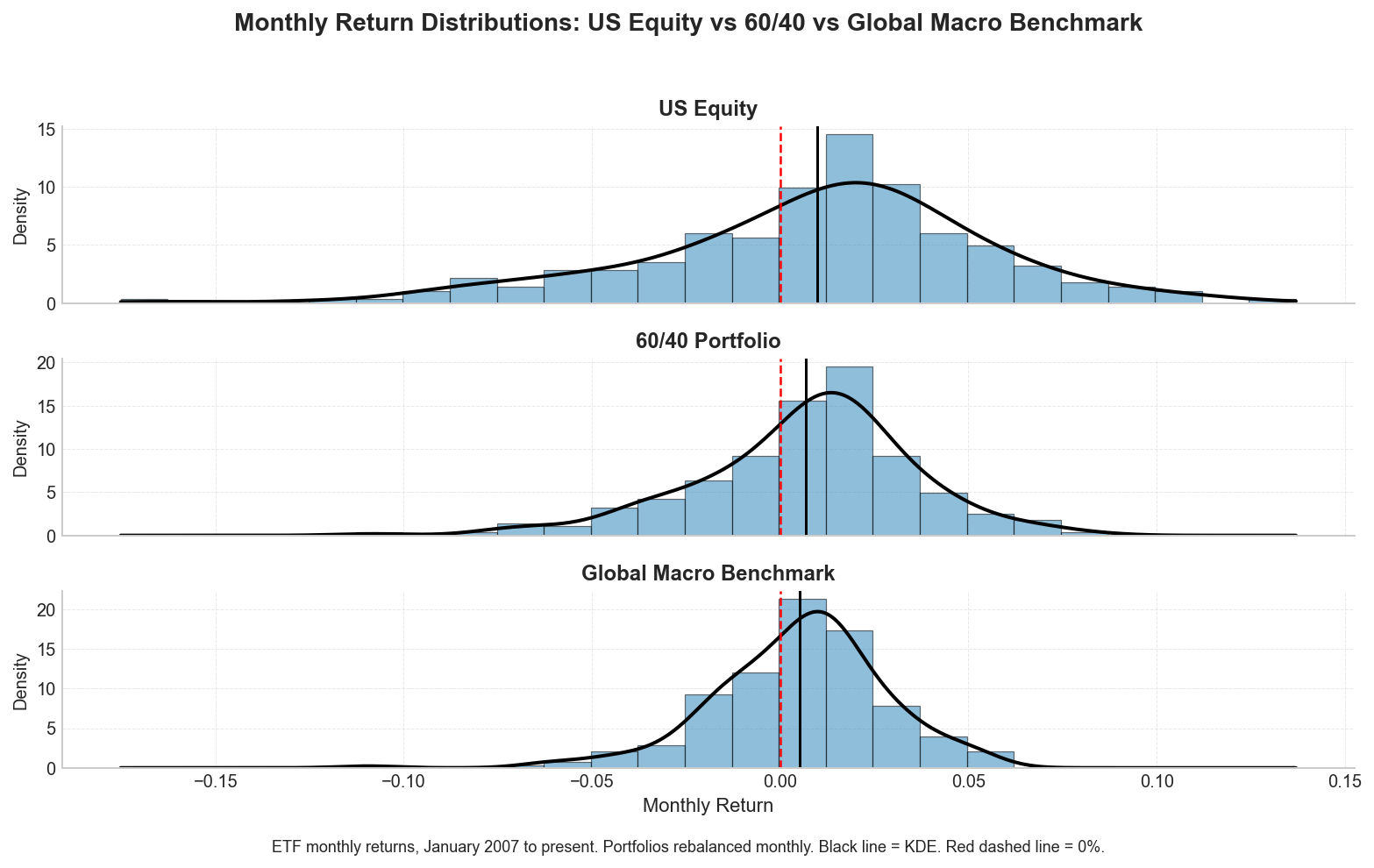
A few observations stand out immediately.
First, US equities exhibit the widest distribution of outcomes. The return profile contains both the largest upside months and the deepest drawdowns. While equities have historically delivered strong long-run returns, investors also need to tolerate materially higher volatility and left-tail risk.
Second, the traditional 60/40 portfolio compresses the distribution meaningfully. Bonds dampen equity volatility and reduce drawdowns, although the portfolio still remains heavily influenced by equity market behavior during stress events.
Finally, the global macro benchmark portfolio produces a noticeably tighter return distribution centered around modest positive monthly returns. Diversification across global equities, duration, short-term Treasuries, commodities, and gold reduces overall dispersion while still maintaining exposure to global growth and inflation-sensitive assets.
Interestingly, all three portfolios generated positive monthly returns at broadly similar frequencies. The primary difference was not how often gains occurred, but rather the dispersion and magnitude of outcomes investors experienced along the way.
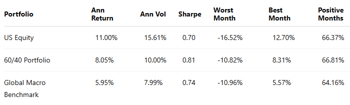
Summary Statistics
The benchmark portfolio shown here represents the strategic allocation framework underlying Shipyard Capital Management. Tactical allocations are adjusted modestly over time based on macro regime signals and cross-asset trends.
Over long horizons, portfolio construction is less about maximizing any single outcome and more about shaping the distribution of outcomes investors are likely to experience.
All charts and tables created by Brian O’Grady using Yahoo Finance and Federal Reserve Economic Data (FRED).